Logo and Visual Identity for 🇩🇰 Danish Project Management Consulting Firm

Logo and Visual Identity for 🇩🇰 Danish Project Management Consulting Firm
Logo and Visual Identity for 🇩🇰 Danish Project Management Consulting Firm
About
How We Helped the Client Solve Their Problem Strategically
Client
Lau Projects is a young, dynamic consulting firm located in the Danish city of Kolding. So far, they have managed to acquire solid smaller clients through references and networking, but their ambition now is to target larger players through digital marketing activities.
Problem
In order to attract lucrative clients and build a reputation as a trustworthy company with expertise, they needed look and communicate that way.
Additionally, for their marketing activities to effectively work in acquiring new clients, they needed a strong foundation in the form of a professional visual identity—an essential step to ensure their marketing investment would pay off.
Solution
We created a professional visual identity and logo, providing them with a solid foundation for future growth and helping them portray themselves as trustworthy experts.
Visual direction
We developed a progressive yet still conservative style that can appeal to both serious and innovative clients
Visual direction
We developed a progressive yet still conservative style that can appeal to both serious and innovative clients
Visual direction
We developed a progressive yet still conservative style that can appeal to both serious and innovative clients

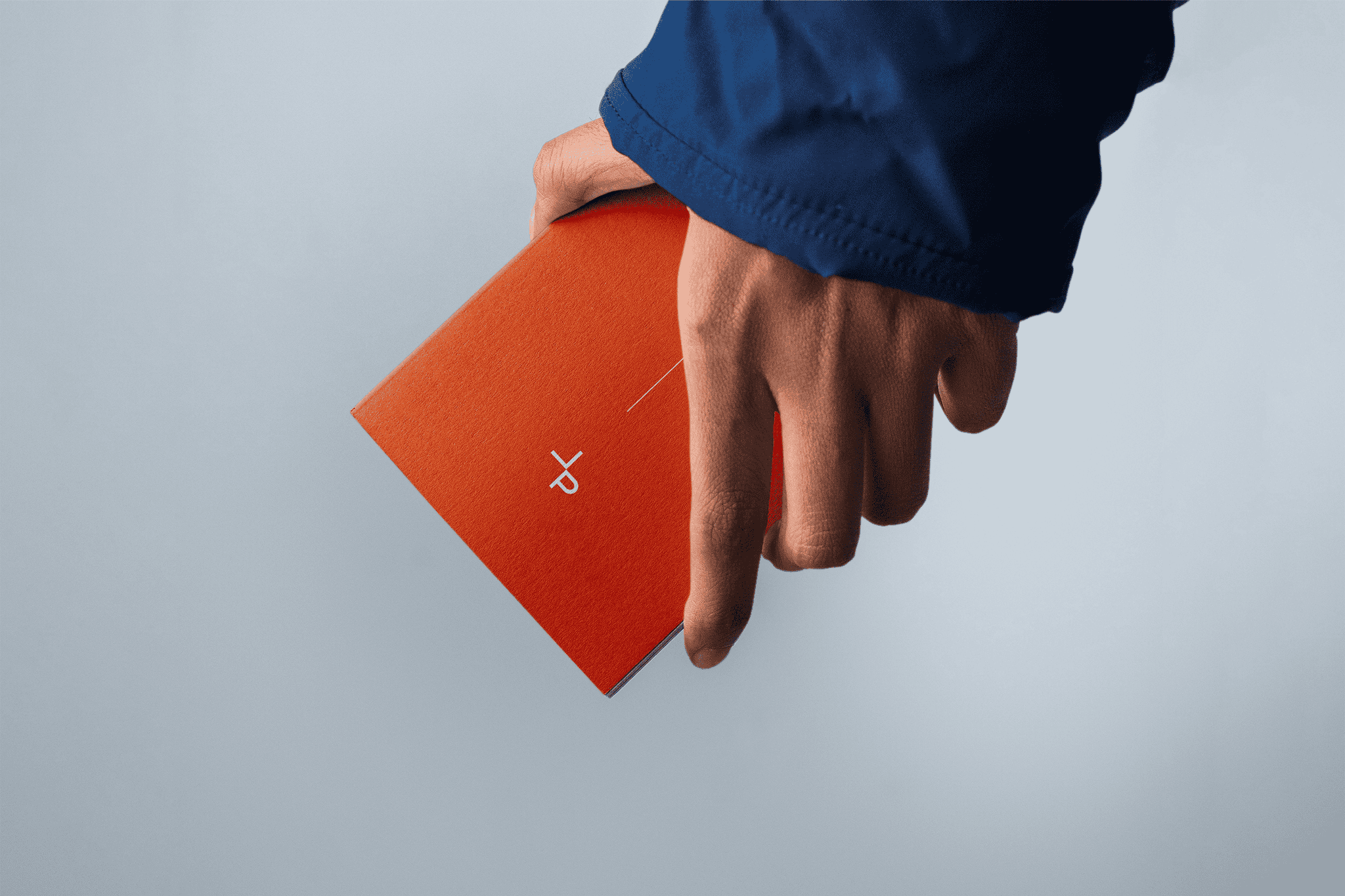
Logo Design
We created a simple, timeless logo from initials. The letter "L" represents Lau Projects company and the letter "P" represents the projects that their consultants successfully manage.
The letters touch each other, symbolizing external collaboration between the client and consultant.
Moreover, the letters are deliberately arranged to create a "+" symbol, which communicates added value and the positive impact that Lau consultants will have on the client's projects.


Visual Identity
We wanted the identity to evoke a sense of trustworthiness while also carrying a hint of progressiveness.
Everything—from colors to font style to graphic elements—was designed with this goal in mind. The result is an identity that strategically communicates with the target audience and helps the client build credibility and authority.


Client's Word
"The new branding completely changed the perception of our company. Clients now see us as a trustworthy and professional partner in project management. Thanks to Mucha & Had, we have a strong foundation for all future marketing activities. The investment in quality design has returned to us many times over."

Laurentiu Tirziu
Managing Partner
Client's Word
"The new branding completely changed the perception of our company. Clients now see us as a trustworthy and professional partner in project management. Thanks to Mucha & Had, we have a strong foundation for all future marketing activities. The investment in quality design has returned to us many times over."
Laurentiu Tirziu
Managing Partner


Strenghten your reputation
Dominate your industry
Engage more customers


Strenghten your reputation
Dominate your industry
Engage more customers
Strenghten your reputation
Dominate your industry
Engage more customers